Skip to content
Lucas Cobb
I'm a web designer, front-end developer, and photographer.
Blog
Photography
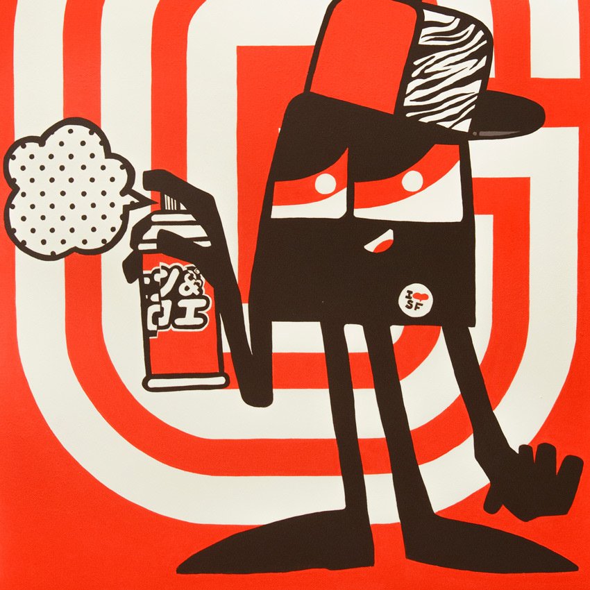
123klan-graffiti-SCIEN
January 16, 2020
Lucas Cobb